Logo
The mark and wordmark.
The wordmark seby. is primary, with the dot in emerald. The s. mark is for square spaces — app icons, favicons, avatars. Click any tile to download.
Clear space
Keep free space around the logo equal to the height of the dot. Never crowd it.
Minimum size
Wordmark no smaller than 80px wide; mark no smaller than 24px. Below that, use the favicon.
Don't
Don't recolour, stretch, rotate, add effects, or place the light wordmark on a busy/light background.
Colour
One accent. Mostly white.
Emerald leads small text; forest carries dark moments and buttons; bright-green is a seasoning. Click a swatch to copy its hex.
Typography
Inter Tight + Inter.
Inter Tight (700–800, tight tracking) for display. Inter (400–600) for body. Never rounded/friendly faces.
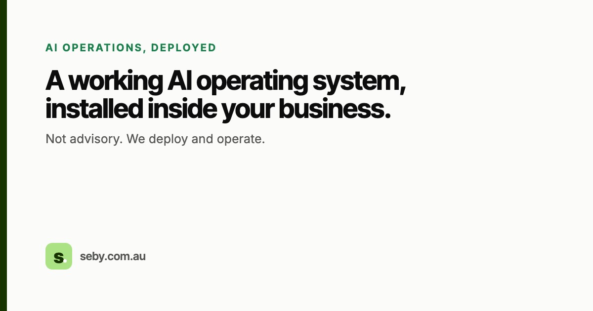
AI operations, deployed.
A working AI operating system.
font-family: 'Inter Tight'; weight: 700–800; letter-spacing: -0.02em We install a working AI operating system inside Australian B2B businesses. Not advisory. We deploy and operate. The quick brown fox jumps over the lazy dog. 0123456789.
font-family: 'Inter'; weight: 400–600 HOW IT WORKS
Inter Tight · 13px · uppercase · letter-spacing 0.12em · emerald Shape & components
Pills, soft cards, big space.
Buttons
radius 999px · forest bg / white text · invert on dark Radius
--radius 22px · --radius-sm 14px · buttons 999px Cards
background #FFF · border 1px var(--line) · radius 22px Voice & rules
Restraint is the brand.
✓ Do
- Keep pages mostly white. Colour is the exception, not the rule.
- Use one accent: emerald for text, forest for dark moments and buttons.
- Treat bright-green as seasoning — the wordmark dot, a checkmark, a numeral on a dark band.
- Give it room: ~124px section padding, big type, few elements per screen.
- Write plain, human, confident copy. Every screen reads on its own.
× Don't
- No rainbow or multi-colour section bands. Never reintroduce the old palette.
- No bright-green full-bleed sections and no bright-green buttons.
- No decorative motifs (the squiggle is retired). No gratuitous gradients.
- No Poppins or rounded/friendly display faces — they read "startup", not premium.
- No stock photography in a product slot — show the real artefact.
Downloads
Everything, ready to use.
Canonical source: seby-website/DESIGN.md · audited on every commit by
check-seby-brand.py. Locked green, 2026-06-05.